
 *DIRECT LINK FOR PART I OF THIS POST*
Last week I addressed finding a creative voice when working with other people’s character's specifically licensed characters. This week, I want to touch on what I said was a different category of work, doing pieces for sole creators and or friends. This will again give insight to my thoughts for long-time readers, and offer up a look at perhaps unseen artwork by new blog readers.While some of the message from last week's blogpost rings true here also, there are a few key differences. Left: My piece for Katie Cook's Gronk where I focused on rendering Harli & Kitty being portrayed as real animals while keeping as true to Katie's design of Gronk & Kitteh as possible.
 The first being that I'm generally being asked to contribute to do something for a creator I have a personal relationship with. This means the request is coming from a place of mutual artistic respect. I admire their work, they enjoy mine. So the expectation on their end is that I will do something in my own style, in a way that looks like what they have already seen and enjoy about my work. It also means that I will do something that honors their property is a way that is nothing but respectful.
Right: My piece for Jeremy Bastian's Cursed Pirate Girl didn't come together for me until I talked to him about getting the right balance of distorted anatomy and my flavor of illustration. Knowing Jeremy so well helped give me the freedom to do this piece that way.
 Unlike the pieces from last week where the characters have been owned by multiple companies and have been portrayed in multiple mediums by several different creative teams, these characters and properties are owned by individuals, and they only have one incarnation. There aren't eras to sort through to amalgamate into one version...there is only their work as the reference and your interpretation.
Left: Subtle changes or wardrobe changes can occur between series, so there may need to be some creative choice making over what versions of the characters to show. For Sean Wang's Runners, I knew the piece was to coincide with the 2nd arc taking place on a wintry planet...but I had to balance his character designs with the way I render the textures and materials in question: rocks, snow, alien skin, wrinkles fur cloaks, quilted parkas etc.
 Like I said in last week's post what I decide to focus on for the piece or what I omit is a way of keeping a creative voice while doing this type of work. I try to work with the creator to pick a character or subject from their series that works well with my skill set and perhaps avoid the parts of their book I may not naturally pay homage to as well. I then focus on the parts of that character I think my sensibilities could render well using my style of framing, texture, and line. Right: With Shane Michael-Vidaurri's IRON book, he'd assigned me the tiger character, so that was locked in for me, but then I thought about what it is that makes Shane's work special and original. Shane's peppers his book with inset panels featuring subtle moments like landscapes or branches, or leaves. And I borrowed his palate as well
 Figuring out what the tone of a piece should be is also a way to keep a creative voice. Should it be humorous, action packed, subtle, introspective? Many creators run the gambit of emotional range in their books. And choosing just one mood can be tough when trying to sum up the feel of that book. Left: With the piece I did for Stan Sakai and his book Usagi Yojimbo, I wanted to show Usagi as a well rounded character. Using the seasonal framework allowed me to do four smaller pieces that together become my version of him. In sprint he's lighthearted and doing something as enjoyable as flying a kite. In summer, he's busy training hard. For fall, I featured the beauty of performing a mundane task, and in Winter he's solemnly standing guard in the cold conditions. I tried to bring to the table a printmaker's voice and also use historical Japanese iconography in each season: the cherry blossoms, the koi fish, the cooking pot, the bridge and hat, as well as the kanji for each season.
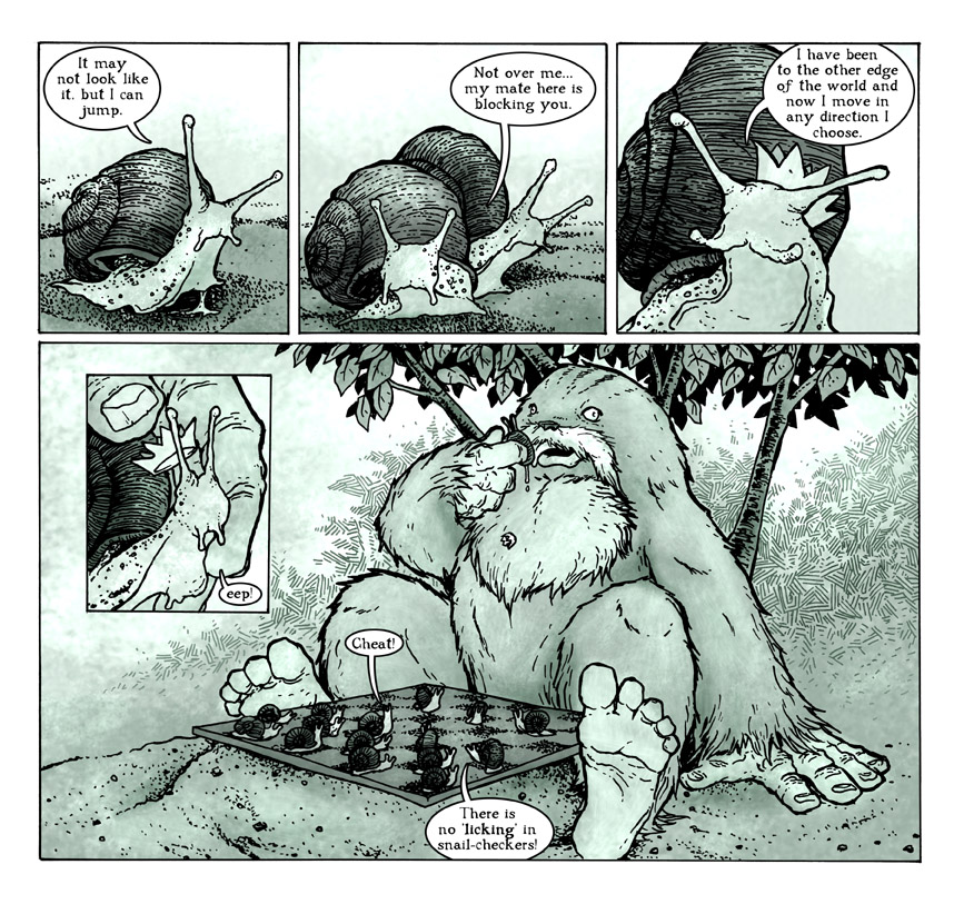 Every pinup and cover should feel like it's telling some story in one image, but there is a bigger creative weight on storytelling with interior pages. To honor the sense of storytelling and subject when writing guest material can be as much of a balancing act as just doing art, if not moreso. Right: In my guest strip for Kark Kerchl's Abominable Charles Christopher, I had to think of something that fit into his northern wilds that would be amusing...and I also wanted to include his main character (who rarely interacts with the other animal characters. Karl does a great job of giving a sense of society and perspective to his ACC characters, there is a serious tone in the way the characters think about life. That was my jumping off point for this. How would snails see their progress in the world....then I abstracted it with the chess concept as a reveal for the joke.
 The way the image will be used can also be a method of introducing creativity and a unique voice to an existing property. Left: For the folks over at Transylvania Televison, I did a design for their tee-shirt. They'd used a piece of mine before on a shirt, but It felt more like an illustration placed on a shirt as opposed to a tee-shirt design. This image needed to have a design element so the borders of the image made sense on a shirt...there is no background or horizon line to ground a standing character. Having LeShock dissolve into bats gave enough design strength and also reinforced the monster-movie tone of the show. Otherwise I took all the Muppet cover lessons and applied them here to a puppet character making the coffin and clothing as textured and real as I could and play up the shapes and colors of the puppet himself.
 All of the above examples were pieces I was asked to do. But there have been times where, just for fun, and as a fan, I've decided to do artwork as an unsolicited gift. Right: This piece for Kory Bing's Skin Deep, was a way for me to have fun drawing all her cool character designs while trying to match the tone of her story and work. I deviated a bit more with the interpretations of the characters than I normally would, I just wanted to have fun and play with the characters. I still paid homage to Kory's work by staying very true to the costumes and the details of her characters. Kory had been playing with using stock patterns as backgrounds in her work at the time, so I used that as a way to fill up the space and give the piece some Skin Deep authenticity.
 Watercolor Wednesday:
Last week's watercolors were all of mushrooms. After painting the first piece, and thinking it would be fun to do another, I wondered "what will be an easy way to tell them apart for the purposes of labeling for the store & blog?" The answer I came up with was to paint a different quantity in each piece and name them accordingly. Another note, on the trio, I used rubber cement to mask out the dots on the mushroom cap, something I don't tend to do with these Watercolor Wednesday pieces.


2013 Appearances:
C2E2: April 26-28
Spectrum Live: May 17-19
Heroes Con: June 7-9
Albuquerque Comic Expo June 21-23
San Diego Comic Con: July 17-21
*more 2013 dates coming*

No comments:
Post a Comment